Dr. Eli Grey: Book Cover & Landing Page Design
Project Info
Year
Type
Roles
Tools
Overview
Dr. Eli Grey is the pen name of a U.S.-based psychiatrist who wanted to publish spiritually provocative writing while protecting his professional identity. With no prior online presence and minimal assets, the project began as a book cover and expanded into a small, yet meaningful visual identity, landing page, and graphics.
At the heart of the challenge: how do you create something that feels personal and trustworthy—without showing a face?
Challenge
- Anonymous by choice: No photos, no backstory, and no author bio—just a pen name and a message to share.
- Bold in content: Dr. Grey’s writing blends mysticism, philosophy, humor, and spiritual reflection to challenge conventional beliefs.
- Designing intimacy without identity: The task was to create warmth and human connection without traditional branding cues—only a name, a question, and a desire to be heard.
Goals
- Design a book cover that reflects the title’s humor and existential weight
- Develop a symbolic, human-centered visual identity from scratch
- Build a one-page site that feels warm, trustworthy, and designed to convert.
Concept
With anonymity as a creative constraint, the visual identity had to do the heavy lifting—inviting curiosity, evoking emotion, and building trust.
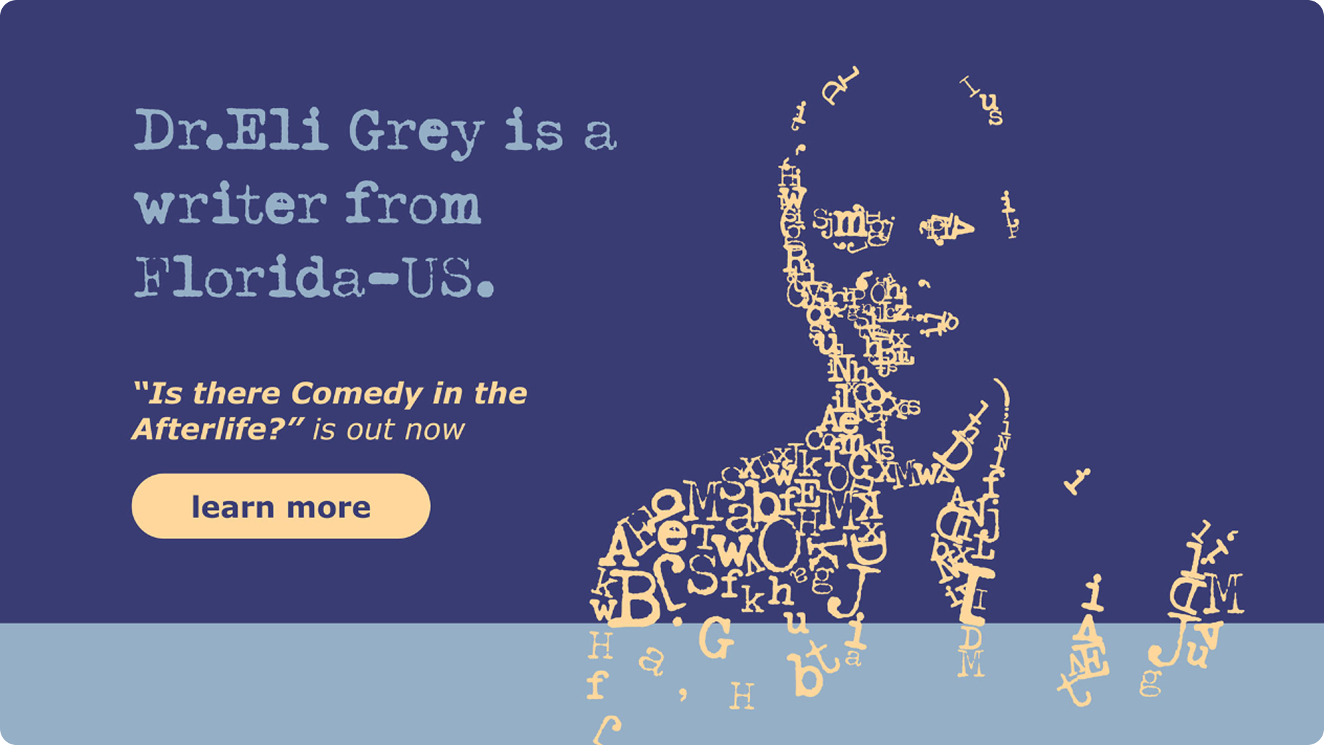
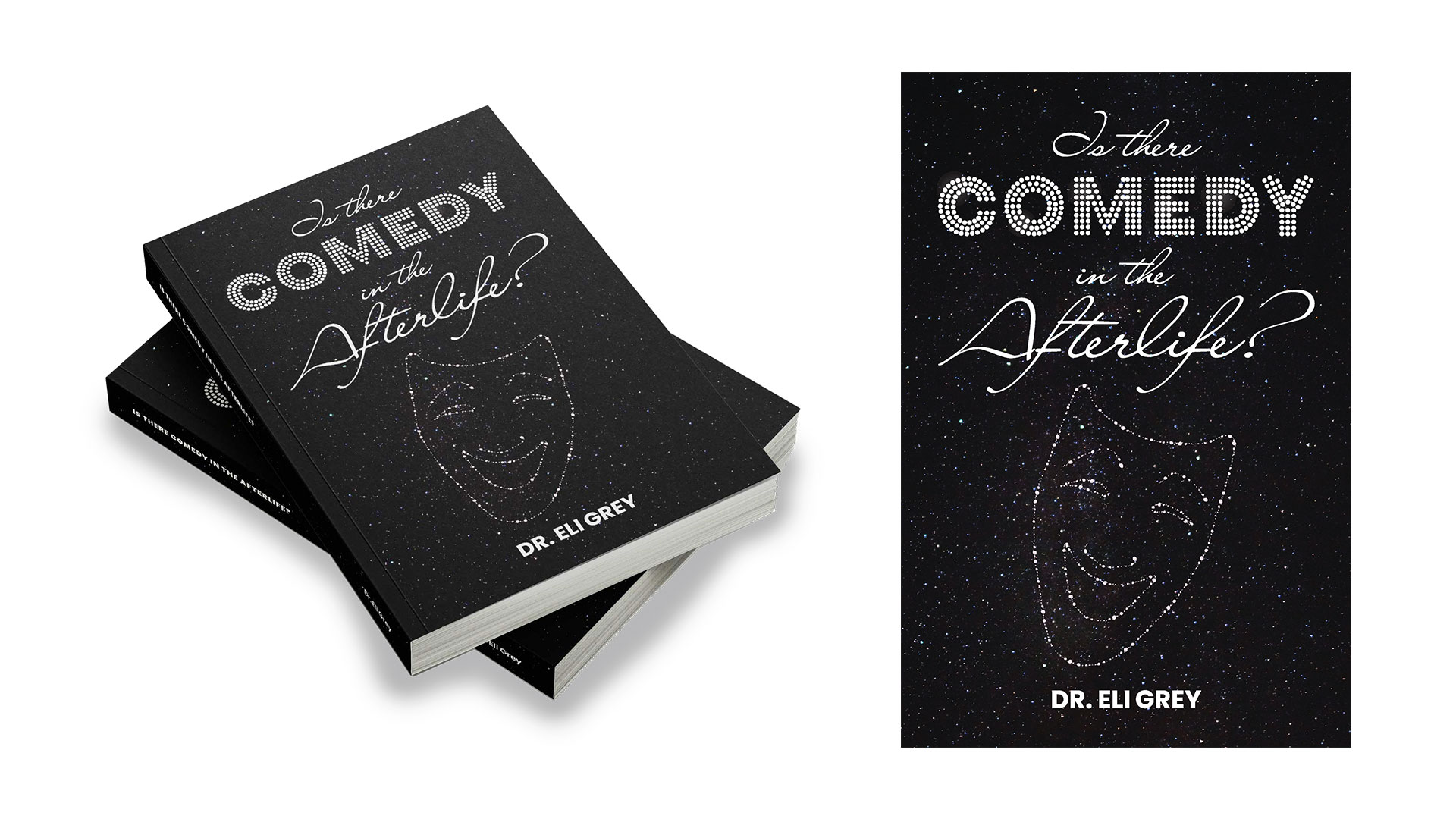
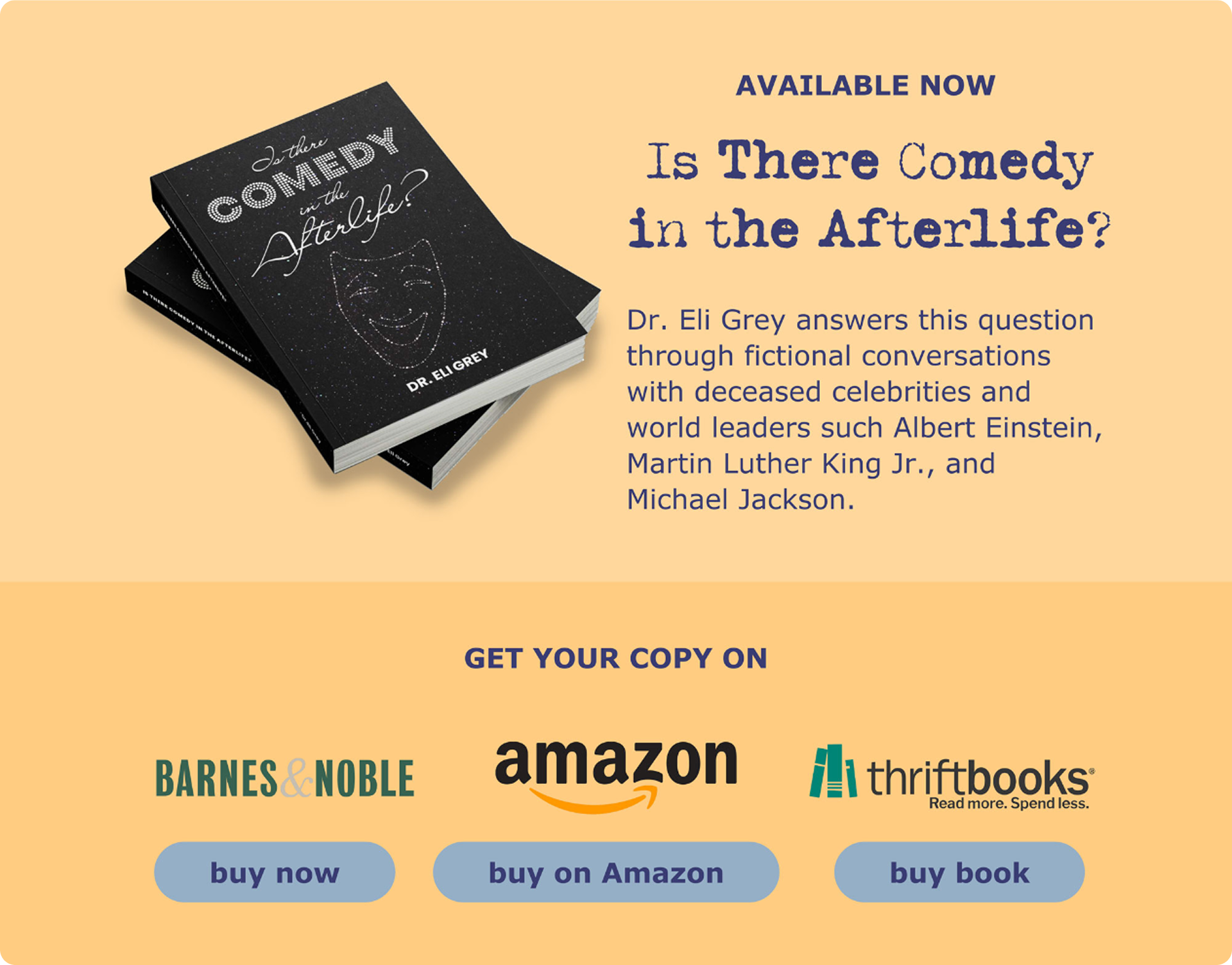
- Book Cover: A starry night sky sets the scene for a glowing drama mask formed by constellations. “COMEDY” shines in vintage marquee lights—echoing the theatrical drama of life—while handwritten type adds intimacy to the cosmic, philosophical question.
- Landing Page: A scroll-based, single-page experience flows gently from Dr. Grey’s message into the book feature and reseller links, ending with a quiet invitation to connect.
Approach
We began with a guiding question: How do you create something that feels personal and trustworthy—without showing a face?
With limited content and strict boundaries around anonymity, the design leaned on metaphor, symbolism, and emotional cues to make the unseen feel intimate.
- Typographic Portrait: Based on a photo of Dr. Grey, I created an abstract “face” using matrix-style characters and subtle shading to suggest a gentle smile—evoking warmth, mystery, and humanity without literal imagery.
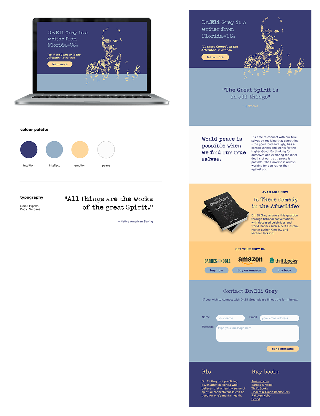
- Colour Psychology: The palette reflected the emotional range of the message—purple for intuition, blue for intellect, yellow for emotion, and white for peace.
- Tone & Typography: Imperfect typewriter-style headlines paired with clean sans-serif body copy created a balance of rawness and clarity—mirroring the message’s blend of philosophy, humor, and vulnerability.
Results
This project showcases what’s possible when storytelling leads. With little input and no face to show, we shaped a presence that felt thoughtful, mysterious, and human. The design stands as an example of how meaningful branding doesn’t always require exposure, just intention.
"Professional, unique
and incredibly creative."
"Joy has been an absolute delight to work with. Her work is professional, unique and incredibly creative. She brings a lot of awesome ideas to the websites she's been building and she also brings a wonderfully positive attitude. I highly recommend working with Joy if you're looking for an amazing experience and beautiful design work done."

" Great communication
and collaboration."
"Joy was a pleasure to work with on a recent graphic design project. She was able to work within the limitations of our deliverables (a toolkit built on Google products and Canva) to produce something truly beautiful and easy for our client to maintain in the future. Great communication and collaboration. I highly recommend engaging Joy for your graphic design needs!"

" The final prints were perfect
inside and out!"
“Thrilled to have the first week hit the charts! Thank you so much.
Everyone was pleased and the final prints were perfect inside and out!”
" I'd hire Joy in a heartbeat again"
"I hired Joy in the spring of 2022 to design the cover for my book, Vegan Marketing Success Stories. [...] I can tell you working with her was an absolute DREAM — and I've worked with some great graphic & web designers in the past. [...] Joy not only presented 3 options for packages but came up with 3 mockups, outlined key deadlines, stayed in communication with me constantly, and provided 14(!) bonus graphics I could use for promotional purposes. When my first proof copy wasn't all that perfect, she encouraged me to wait until I got the next copy before taking photos—a testament to her care for quality. I am THRILLED with how my book cover turned out and having additional graphics support took one less thing off my plate. I'd hire Joy in a heartbeat again, especially if you want a pro who cares about your work just as much as you do."

"Very clear on her communication
and super organized"
"Joy was exceptional to work with. She's very clear on her communication and super organized with the entire process. She helped me refresh my website design and I couldn't be happier! Totally worth it!"

"Excellent at taking feedback/ideas to heart and then putting them into action"
“So thankful for the opportunities to work with Joy! She's professional, level headed, wonderfully creative and excellent at taking feedback/ideas to heart and then putting them into action- a dream. Joy delivered a timeless, clean and fun design as part of a very important project for nationally distributed seasonal consumer packaged goods and I could not be more pleased with the end result! Fantastic communication, too. Thank you, Joy! Looking forward to our next chance to work together again.”

"Her patience and high level design
skills are second to none!"
“Joy's excellent design and layout skills were key, in producing the design plans and layout for the current Pravada floors website. Since she left Pravada with some of the most beautifully designed branding, we have continued using her templates and branding standards. I truly miss working collaboratively, playing off each others skills and learning from each other. Her patience and high level design skills are second to none!”

let's co-create
Got an idea?
Let's design something that represents your mission and speaks for you.


