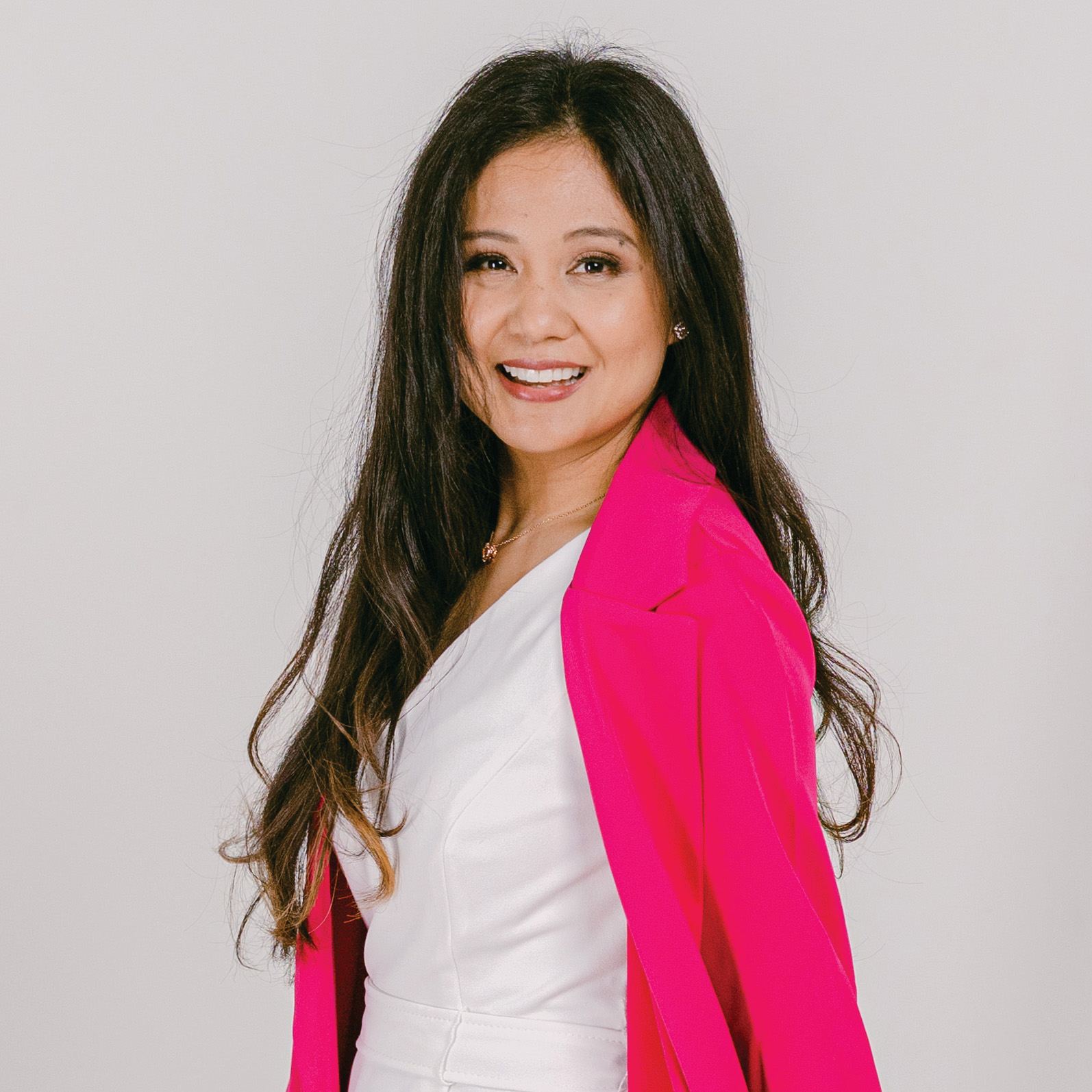
Joy Lopes: Personal Brand & Website Redesign
Project Info
Year
Type
Roles
Tools
Overview
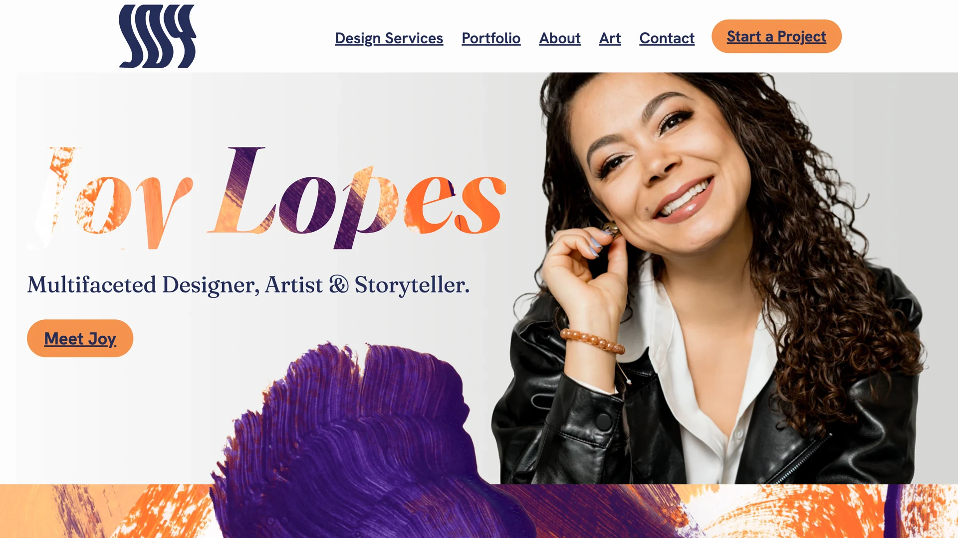
This rebrand marks the evolution from my site’s earlier version—a first attempt at aligning my creative identity online. With V2, I embraced my multidimensional nature more fully, blending design, art, and story into a soulful, intuitive experience. It’s both personal and expansive, crafted to welcome aligned audiences while opening doors to new offerings. Every choice was made with sustainability, accessibility, and intentional impact in mind.
Challenge
- Designing a site that serves both as a personal brand hub and the home of JOLO Design Studio.
- Ensuring Joy Lopes remains front and center to reflect the personal tone and collaborative nature of my work with clients.
- Balancing layered, textured visuals with performance—maintaining a light carbon footprint despite rich artwork.
Goals
- Create a unified experience for both my personal and business offerings
- Keep the site as sustainable and accessible as possible without compromising on vision
- Infuse storytelling into every layer of the site—for deeper engagement and resonance
Concept
The Creative Shapeshifter
This rebrand was inspired by the idea that creativity is layered, multidimensional, and ever-evolving. Just like a shapeshifter, the site reflects different facets of my identity — design, art, storytelling, movement — all coexisting. It’s about honoring the complexity of human experience and expressing it through fluid visuals and intentional storytelling.
Approach
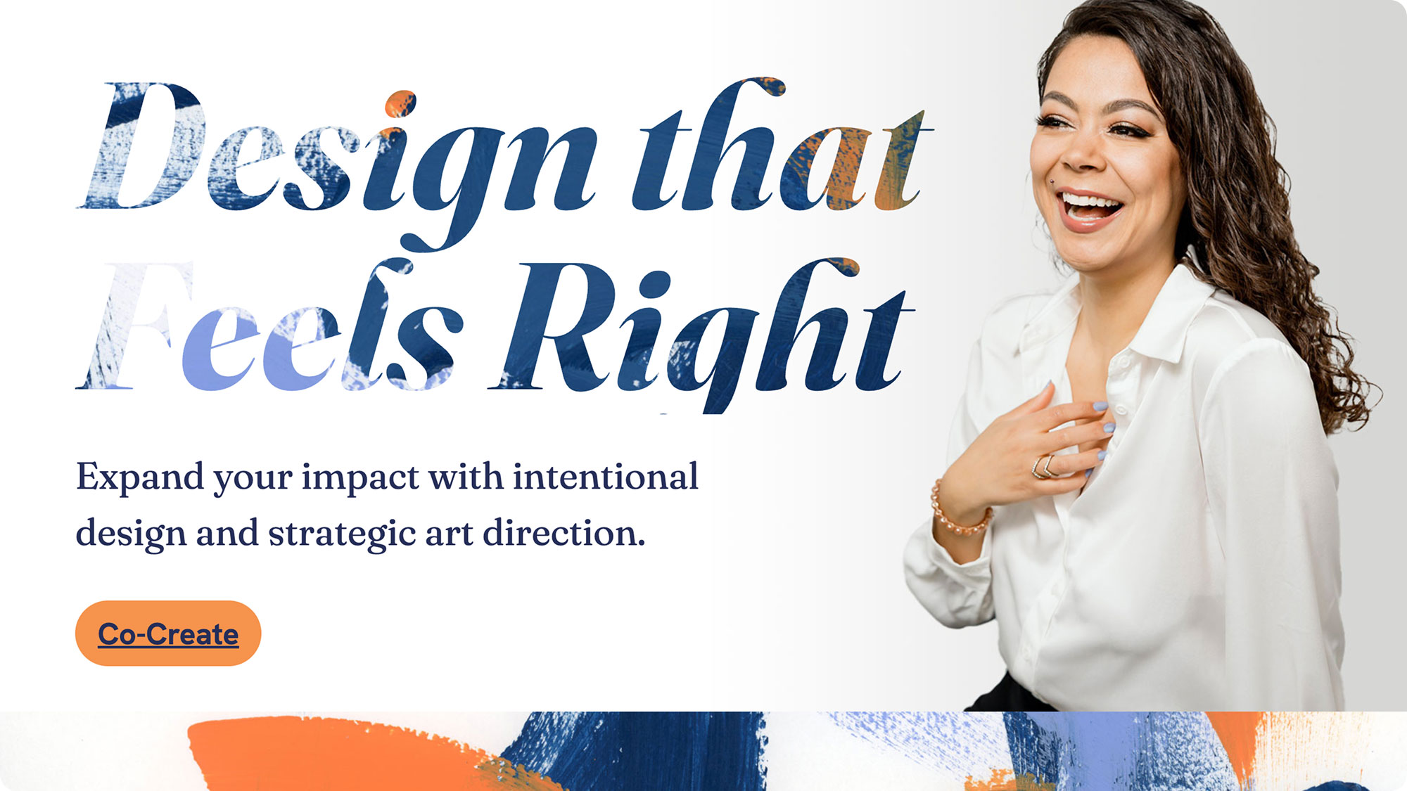
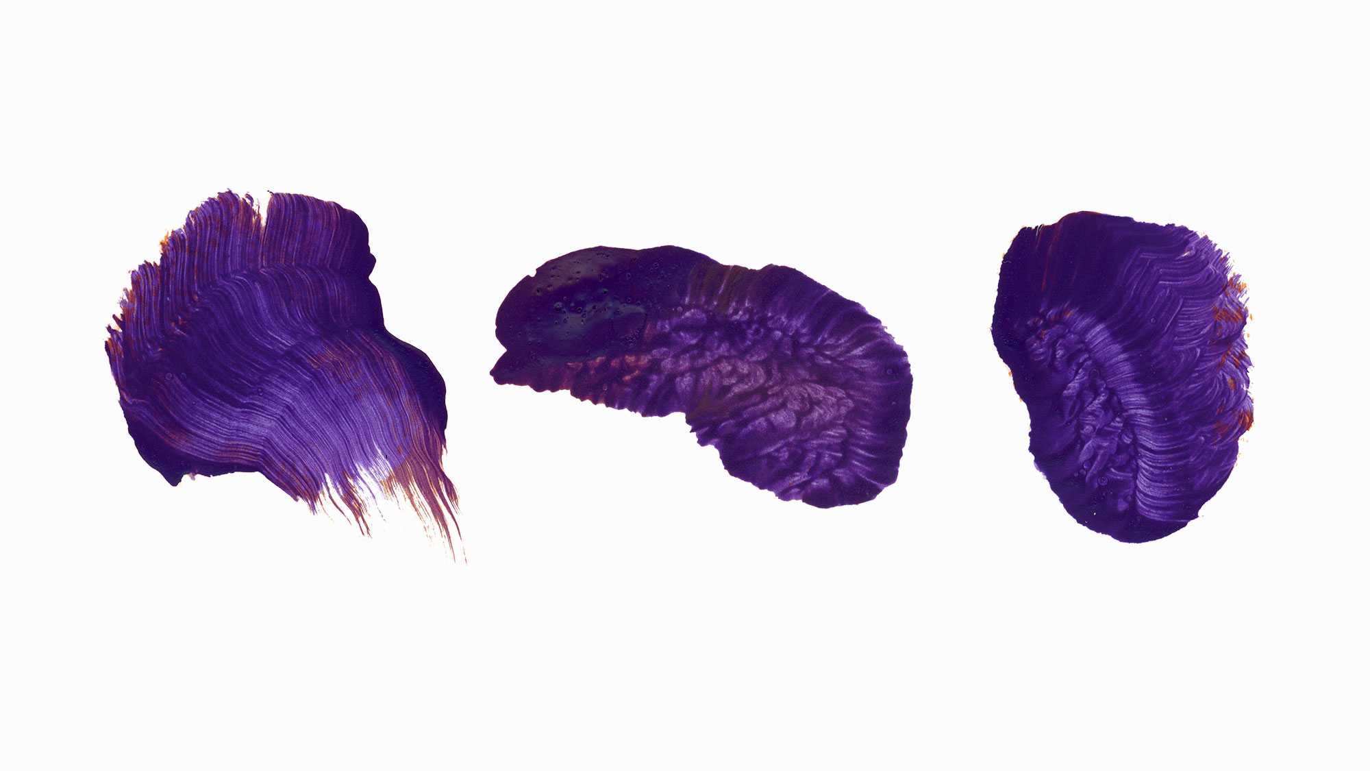
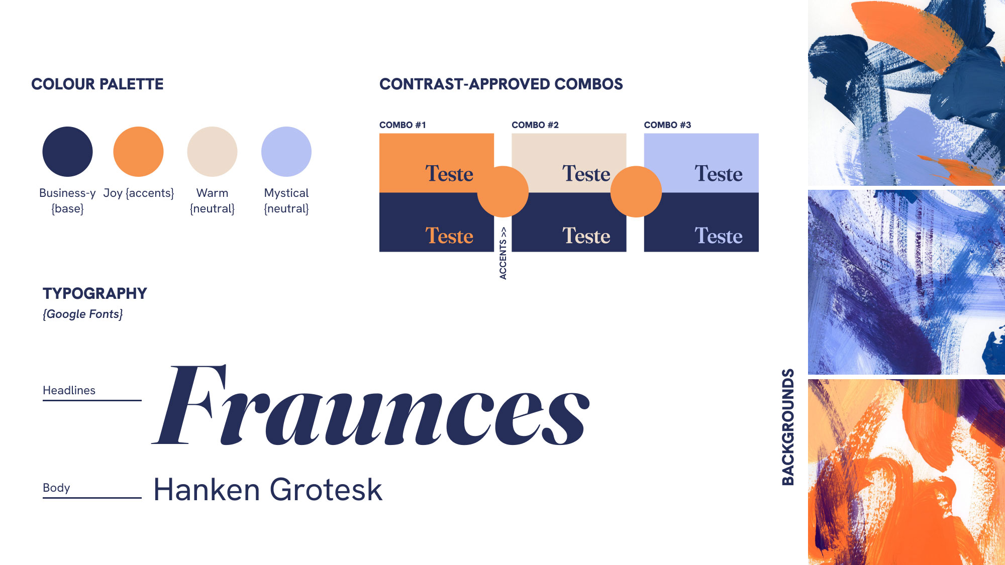
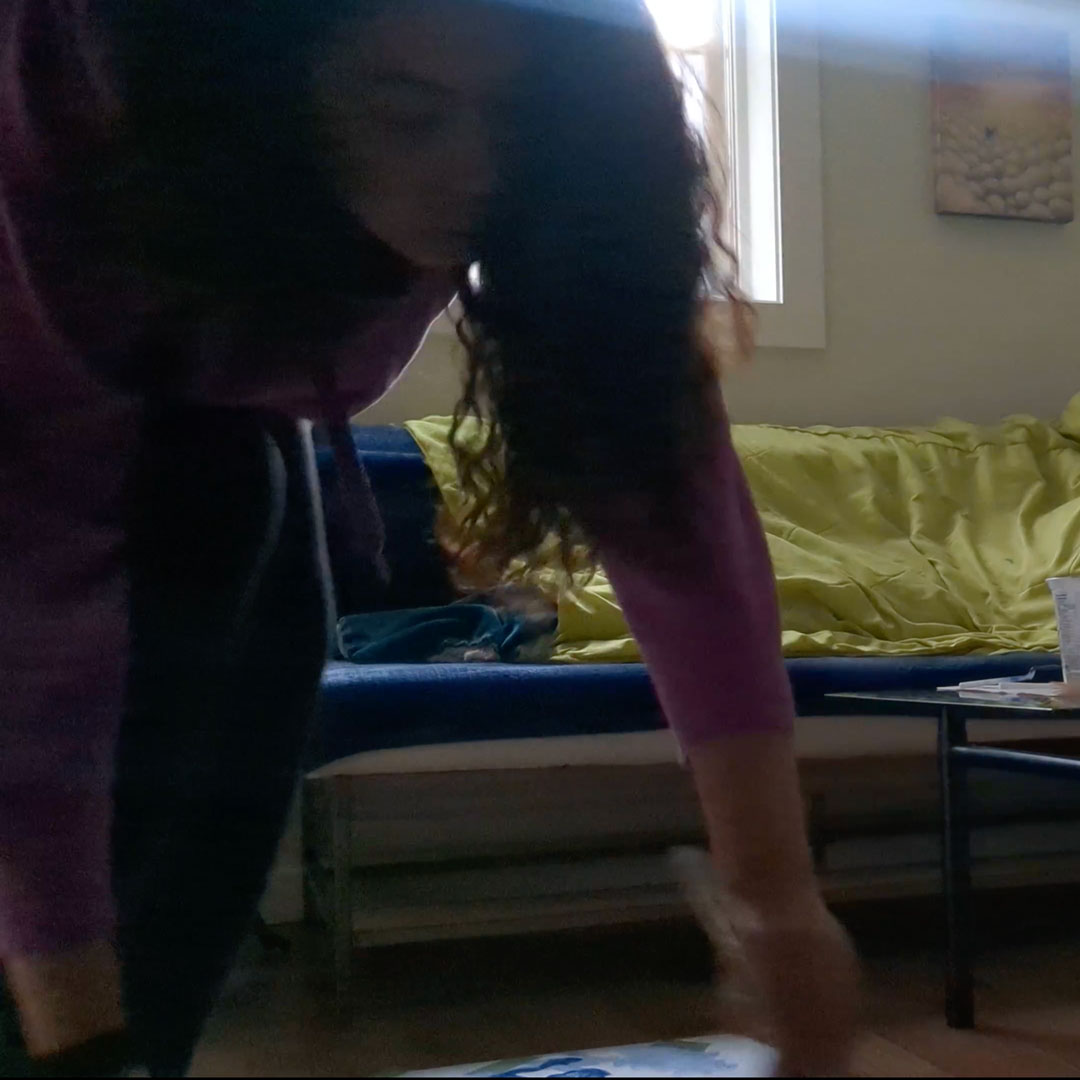
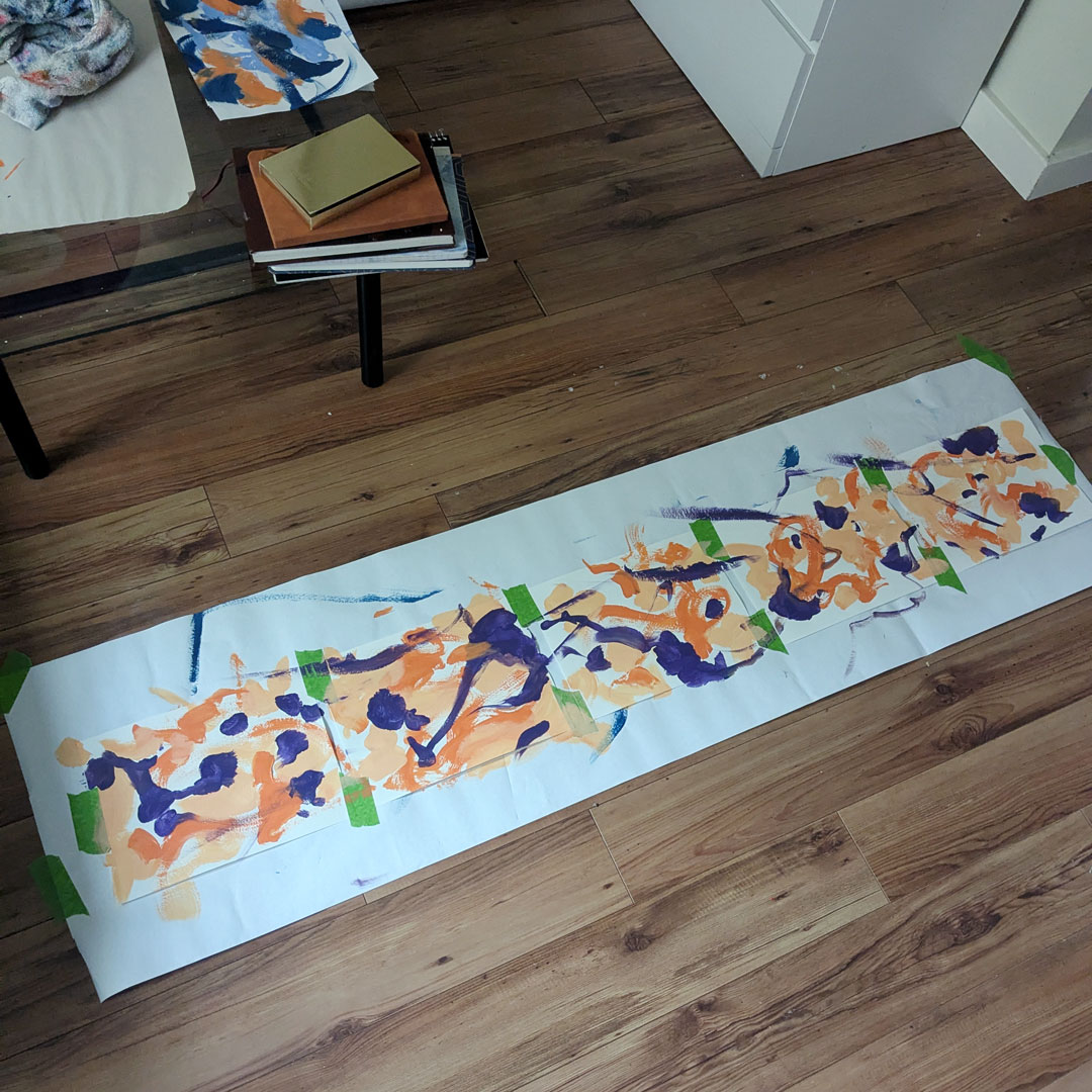
To evoke that sense of depth and authenticity, I combined original paintings, photography, graphics, and subtle motion in a prismatic, multi-sensory interface. Inspired by the quiet magic of flipping an oracle card, elements of the site reveal themselves through interactive moments — images that shift shape on hover, unexpected messages tucked into layered layouts. The colour palette balances business-freshness with joyful warmth, while the tone leans mystical and intuitive with thoughtful surprises built in to reward exploration.
Results (in progress)
- A site that truly feels like me — This second iteration finally reflects the depth and warmth of my creative identity. With layered visuals and personality-rich photography (captured by the talented Michelle Diamond), the site feels both personal and professional in just the right balance.
- Greener with every iteration — V1 achieved a solid carbon rating of B. Once this updated version is fully indexed, I’ll be comparing footprints to track how much visual storytelling can be done within sustainable bounds.
- Refining for resonance — I’m continuing to evolve the site’s motion and messaging to deepen accessibility and emotional connection. The goal? That someone, somewhere, lands here and feels moved enough to say: “I had to reach out.”
let's co-create
Got an idea?
Let's design something that represents your mission and speaks for you.

